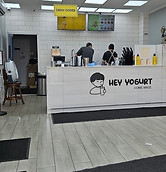
_edited_edited_edited_e.jpg)
Hey Yogurt Mobile App
Making ordering, delivering, and customer interaction easier
Passion Project
UI/UX Designer
UX Researcher
Toolkit
Figma
Figjam
Google Forms
Duration
1.5 months solo work
(June - July 2024)
The Problem


Hey Yogurt is a growing Korean yogurt drink company that recently opened many stores near my home. I constantly hear my peers complaining about having no efficient way to have their drinks delivered to their home, or order before picking up to save time.
→ EASY MOBILE ORDERING
→ UPFRONT INFORMATION
→ REWARDING FEATURES
→ ACCESSIBLE CUSTOMER SUPPORT
Solution
Research Goals
My primary research goal was to determine what was working and not working with existing Hey Yogurt ordering platforms and other apps for different drink companies.
Click Around the Final Prototype!⤵️
User Surveys
I surveyed 15 friends who live in my area. I provided them with the Hey Yogurt website and asked these questions:
-
What are the aspects of the website that work and are helpful?
-
What is difficult to navigate on the website?
-
Do you wish there were any additional features on the website?
-
If you use apps for other drink/food companies, what works and doesn't work?
-
What are the pros and cons of ordering anywhere in person?
Affinity Diagram
I grouped together common quotes from the responses and divided them into two main categories:

User Personas
Based on my research, I created two imaginary user personas facing distinct inconveniences in their very different lives. Let them help you visualize real customers.

Frustrations
-
It is a big hassle for him to drive to the store and order physically.
-
He wants to know what is in his kids' drinks but Hey Yogurt does not provide enough direct nutritional information.
-
He wants his children to try new flavors but feels bad asking the busy employees for flavor suggestions.
-
He has complaints about the employees.
Goals
-
He wishes he could order off his phone efficiently.
-
He would like to be able to read detailed nutritional facts to know what his kids consume.
-
He would like to see other customers' suggestions and experiences from the store.
-
He wants to complain about certain employee behaviors without having to directly talk to them face to face.
David
-
40 years old
-
Working Father who buys Hey Yogurt for his two tweens after he gets off work
Emma
-
16 years old
-
High school student who drinks Hey Yogurt up to four times a week because she likes to treat herself after school.

Frustrations
-
She walks to the store every time but is frustrated with waiting, especially with other students from school. Her social anxiety does not help either. Since it is so busy after school, the employees sometimes get her order wrong. She tried to order off Uber Eats or Doordash but it was much more expensive.
-
Since she buys so much from Hey Yogurt, she wants to work at her favorite drink shop and earn money. She doesn't know how to apply for jobs as she is new to it.
-
She thinks she is her local Hey Yogurt's #1 customer, but is there any benefit to that?
Goals
-
She wishes that there was a direct Hey Yogurt app to order from.
-
She would love to work at Hey Yogurt, as it is a comfort spot for her. She wonders if there is an easier way to apply to work there.
-
She wishes there were promos and rewards she can easily access so she can save money on Hey Yogurt spendings.
Competitor Analysis
The respondents to the survey and the personas mentioned using other apps, so I conducted a competitor analysis to compare common food-ordering app features among four similar mobile apps. All these features are included in the Hey Yogurt App to give users the best customer experience.

Research Findings: What Customers Want
Customer support
Users want the customer service online to be easy like it is in person.


Easily Accessible Info
Users want easy access to extra information about the product.
More than just ordering
Users want more beneficial features from Hey Yogurt.

Direct mobile ordering
Users want a direct way to order online from Hey Yogurt.

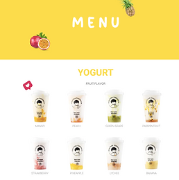
First, Appeal to the Eye
I decided to base the app's UI on the existing kiosks in stores. I noticed that one of the successful aspects of Hey Yogurt's website is its use of the brand's bright and eye-catching colors.
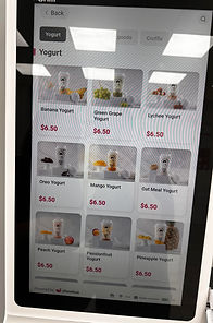


I also drew inspiration from Hey Yogurt's existing website, but also keeping in mind its flaws.

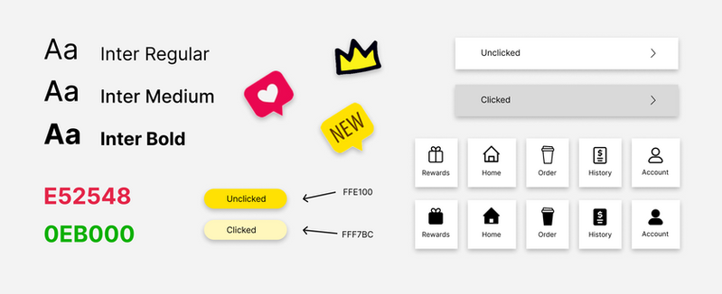
❌ White text on yellow background or vice versa can be hard to see for some.
✅ Based on the user surveys, the emotes and additional information is helpful and interesting.
A bit more on the yellow-on-white and vice versa:
(Low contrast sensitivity) The luminosity contrast ratio is a measurement of the contrast between the background and the text color used on top of that background. As a standard, Web Content Accessibility Guidelines (WCAG) recommends that the luminosity contrast ratio of images and text meets a contrast ratio of at least 4.5:1. Although the original design meets the minimum contrast, I believe that higher contrast is a safe measure to take to reach more users.

Final UI elements
User Flow
Let's see how a user might move in the app now that we know what users want.

START
FINISH
Action: The actions that users must take to move through the app.
Screen: The different screens of the app that users will experience while completing tasks.
Decision: The points where users must make a decision.
Wireframes
Time to get into action. First, I made low-fidelity wireframes based on existing apps and then turned them into high-fidelity wireframes responding to the customer's needs. The transition between the two required many changes to the original structure. The icons from the research findings above indicate which part of the customer's needs the screen's feature satisfies.
Low-Fidelity
High-Fidelity
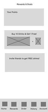
I removed the box containing info on reward points because it is repetitive with the page dedicated to rewards.
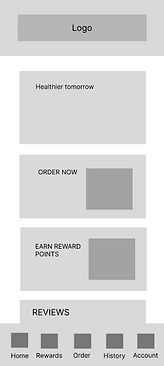

Putting an order button on the home page allows for quicker access to the main purpose of this app!
Clicking on the rewards button will bring up a QR code for easy access and scanning of rewards.
I moved the 10 drink feature to the home page because it would be updated often

I removed the filter button because Hey Yogurt does not have any filterable features among locations.


Store hours will be shown when the information icon is clicked.
I removed the best sellers from the order page because it takes up a lot of space and is repetitive because the same items will show up later.
Horizontal scrolling is inconvenient because it requires extra action.


I added tags to indicate special items instead of creating a whole new category on the menu.
Only vertical scrolling is needed to see more drinks.

I removed the total amount on the bottom because it is repetitive when it is also written on the top of the screen.

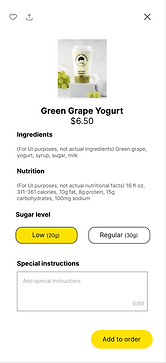
Detailed nutritional
information provided for people who need to know for dietary concerns.
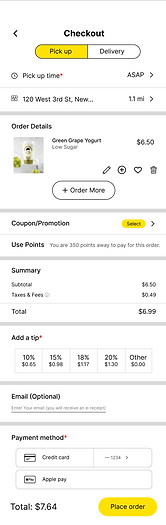
I realized putting the "Clear all" button too close to the checkout button can easily cause mistakes


I added the pickup/delivery option on this screen because the user may still change their mind.
I added a coupon/promo option.

I added the favorite and order again buttons so users can easily buy what they previously bought

I added "Suggestion Form" and "FAQ."
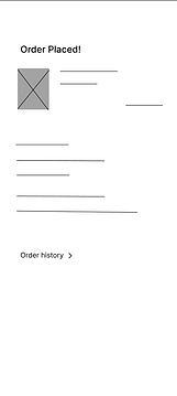

I added an order placed screen that appears immediately after purchase to give the user immediate feedback for their action.
Reviews help users make decisions
Key Takeaways
Mindfulness of the UI
When designing the app, I noticed that different UI aspects compete for the user's attention. Every color, font size, and font thickness matters in leading the user's eye.
Broader Competitor Analysis
I wish I had done further research on other drink-ordering apps so I could incorporate the data into my decision-making. I found myself frequently referring to the Gong Cha app.